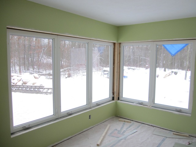
Upon the recommendation of our painter we chose Sherwin-Williams ProGreen 200 paint for the interior walls and ceilings. It’s a low-VOC paint, not quite zero-VOC but low enough to improve our indoor air quality. It had almost no noticeable odor when it was being applied, and what little odor there was dissipated quite quickly. The ceilings have two coats of the ProGreen primer, which has a flat finish, and the walls have one coat of primer plus two coats of eggshell paint.
December 19, 2009
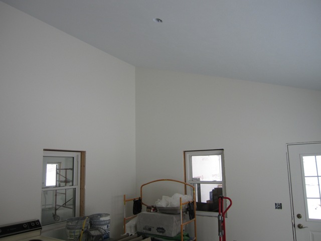
The painters began by spraying primer on all the interior walls and ceilings. The first photo below shows the weaving studio looking east with the kitchen on the left. The second photo shows the main dining room.
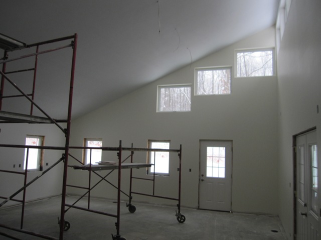
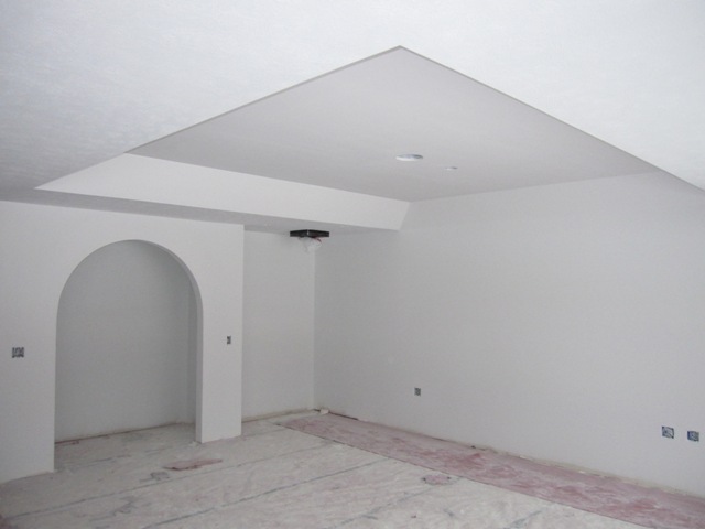
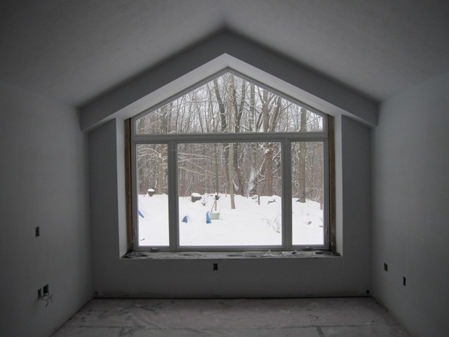
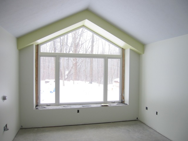
The first photo below shows the main living room, with the nook on the left and the tray ceiling over the theater wall. The second photo shows the peaked window at the south end of the cottage great room.
December 22, 2009
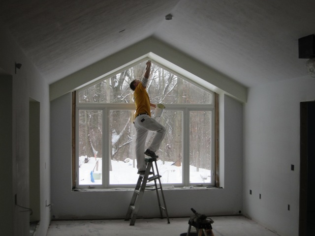
The painters started painting in the cottage, here applying a pale yellow to the peaked soffit over the south window. The second photo shows the kitchen area on the left and the dining area on the right.
The cottage porch is a nice spring-like green. This photo doesn’t capture the color well, as in reality it looks less like pea soup and more like pale green leaves.
December 29, 2009
Painting in the cottage is nearly complete. We changed the pale yellow over the peaked soffit to a brighter sunny yellow (more about that below). The second photo below shows the middle bedroom, with pale aqua walls.
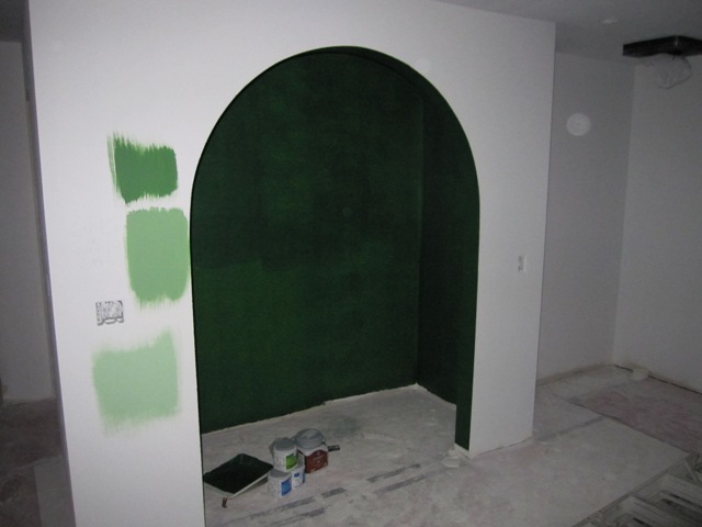
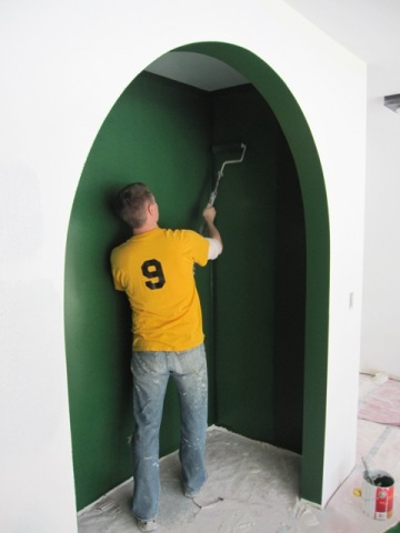
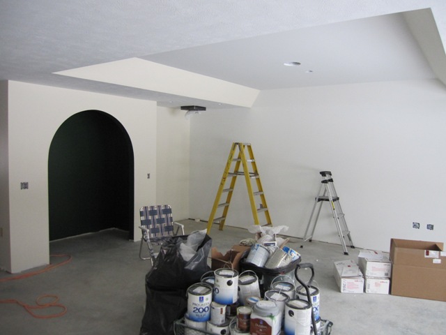
Originally we had planned to paint the nook in the main living room dark green inside and a lighter green outside, so we had the painters apply some sample greens to see how they looked. In the first photo below there’s only one coat on the inside so it looks quite uneven. We decided that it would be too much green to do the outside in green too, so we opted to make the outside an off-white like the rest of the living room and to keep the nice dark green inside with a pale blue ceiling.
January 7, 2010
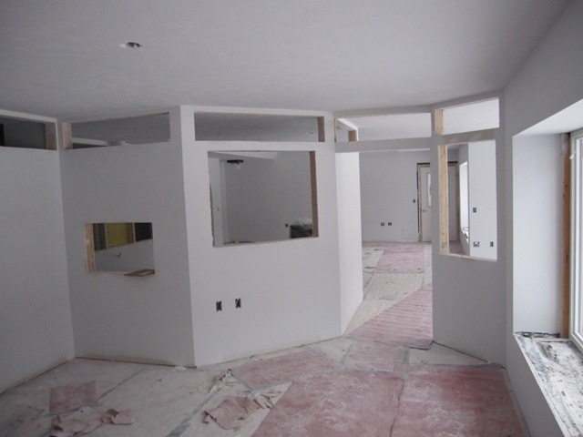
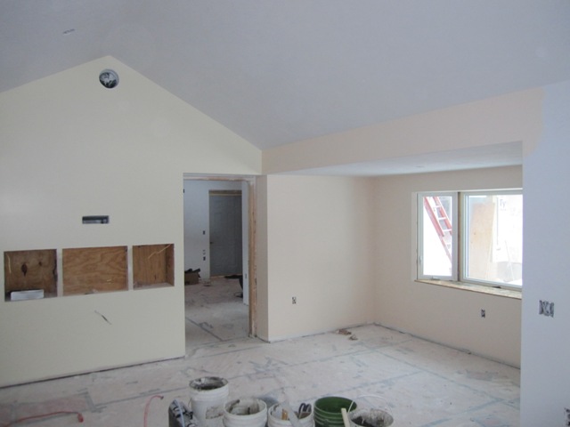
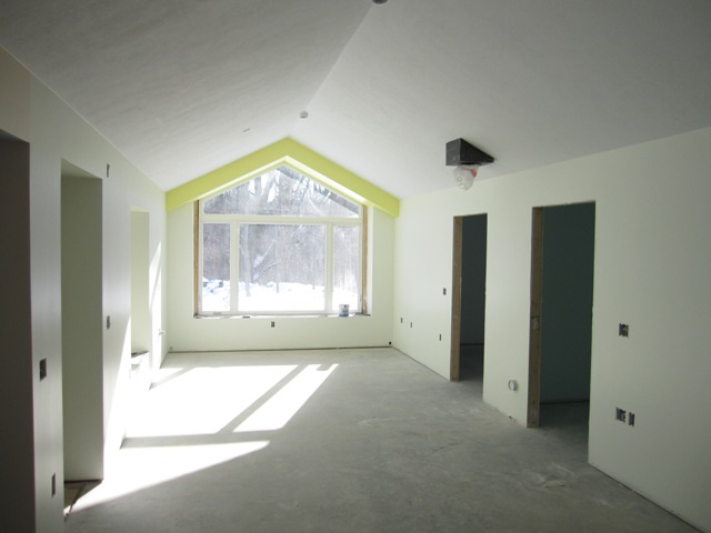
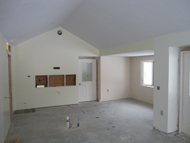
The bright yellow color (Sherwin Williams’ Fun Yellow) on the soffit in the cottage great room was just a bit too much, rather like a big banana. So we cut it with one part Fun Yellow and three parts white, resulting in the soft yellow shown below. It’s still brighter and more ‘fun’ than the original pale yellow, but considerably tamer now. The second photo below shows the opposite (north) end of the great room, which will be the kitchen area, and the dining area is to the right. The big openings in the north kitchen wall are for appliance garages, which will provide storage for countertop appliances.
Here are the two cottage bedrooms. The south bedroom, on the left, will have a closet along the right-hand side of the window so the sitting area by the window ends up the same size in each bedroom. The pink foam insulation and exposed framing will be covered by a built-in bookcase and trim.
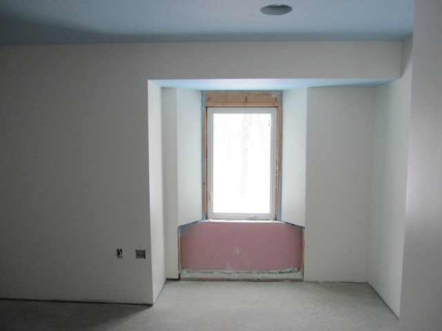
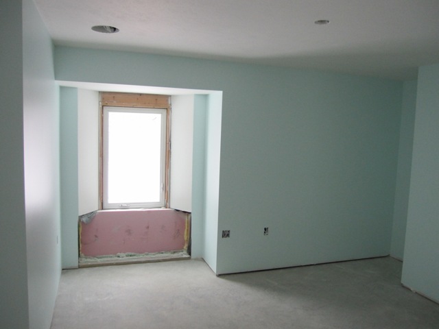
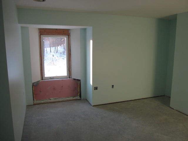
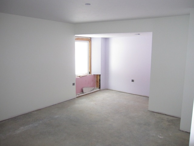
The first photo below is the west bedroom in the main house, which will be Jay’s office. The second photo is the main bedroom with a sitting alcove by the window.

Here’s the living room of the main house. The theater wall is to the right in the first photo, and you can just see the chimney for the wood stove poking down out of the ceiling. The second photo shows the main dining room, with the kitchen on the right.

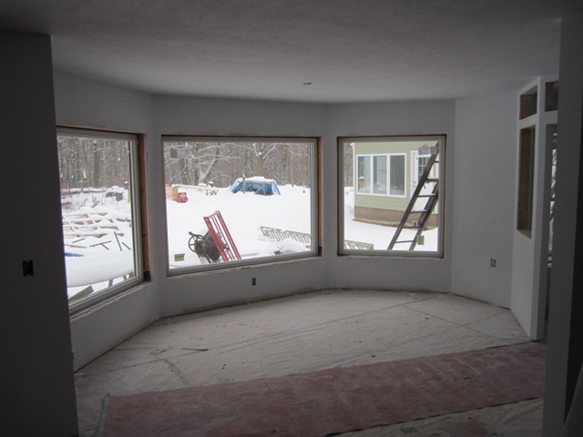
The sun porch, which sits over the cistern, has cream-colored walls and a very pale blue ceiling. The second photo shows the east wall of the workshop.